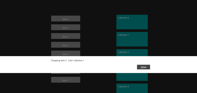
When using Drag and Drop with lists of data, it’s fairly easy to see where the item is going to be dropped as the surrounding items move out of the way when the pointer moves across the list. However, if there are a grid of items and you want to drop something onto one of the items themselves, there’s no obvious way to highlight that you’re able to do it.
In WPF there’s an event such as GiveFeedback which can be used to highlight that something can be dropped. Unfortunately this isn’t available in WinRT.
In this example I’ve decided to highlight where an item can be dropped by toggling the border color surrounding some content. If the border is switched to red, then the currently dragged data can be dropped.

Unfortunately you can’t create your own version of a Border control, to which you could add dependency properties to handle DragOver and related events.
I was able to get around this by creating a behaviour that encapsulates a Command property (which can be executed when the content is dropped) and an attached property that allows an instance to be created with a reference to the border control. This then allows adding event handlers to border control (rather than handling them in code behind).
public class DropCommandBehaviour
{

...

/// <summary>
/// Attached property to be used with Border control - this allows us to create an instance of the DropCommandBehaviour
/// class with a reference to the Border control
/// </summary>
public static readonly DependencyProperty AttachedDragDropBehaviourProperty =
    DependencyProperty.RegisterAttached(
        "AttachedDragDropBehaviourProperty", typeof(DropCommandBehaviour),
        typeof(DropCommandBehaviour), new PropertyMetadata(null));

private DropCommandBehaviour(FrameworkElement element)
{
    _targetElement = element;

    _targetElement.DragOver += OnDragOver;
    _targetElement.DragLeave += OnDragLeave;

    DragEventHandler dragHandler = OnDrop;

    _targetElement.RemoveHandler(UIElement.DropEvent, dragHandler);
    _targetElement.AddHandler(UIElement.DropEvent, dragHandler, true);
}

private void OnDragOver(object sender, DragEventArgs e)
{
    UpdateDragFeedback(sender, true);
}

private void OnDragLeave(object sender, DragEventArgs e)
{
    UpdateDragFeedback(sender, false);
}

private void OnDrop(object sender, DragEventArgs e)
{
    var listview = sender as UIElement;
    if (listview == null)
        return;

    var command = listview.GetValue(CommandProperty) as ICommand;
    if (command == null)
        return;

    object obj;
    e.Data.Properties.TryGetValue("DragDropCollection", out obj);

    var dropCollection = obj as DragDropCollection;
    if (dropCollection == null)
        return;

    command.Execute(dropCollection);

    UpdateDragFeedback(sender, false);
}

/// <summary>
/// Show feedback by executing the Command set on the Command property
/// </summary>
/// <param name="sender"></param>
/// <param name="isDragging"></param>
private void UpdateDragFeedback(object sender, bool isDragging)
{
    var element = sender as UIElement;
    if (element != null)
    {
        var command = element.GetValue(DragFeedbackCommandProperty) as ICommand;
        if (command != null)
            command.Execute(isDragging);
    }
}

}
In the XAML the behaviour is referenced from the border control. So with the attached property, event handlers are added to the DragOver, DragLeave and Drop events. These call the method UpdateDragFeedback which in turn executes the command specified in the behaviour binding – in this case the UpdateDragFeedbackCommand on the item being dragged onto. The item then updates a value depending on whether it’s over it or not and this value is bound to the border control’s color (using a value converter).
<ListView Grid.Column="1" Margin="50,100,0,0" Width="250" ItemsSource="{Binding ContainerCollection}">
    <ListView.ItemTemplate>
        <DataTemplate>
            <Border local:DropCommandBehaviour.Command="{Binding DataDroppedCommand}"
                local:DropCommandBehaviour.DragFeedbackCommand="{Binding UpdateDragFeedbackCommand}"
                BorderBrush="{Binding IsDragOver, Converter={StaticResource BoolToBorderBrushConverter}}"
                BorderThickness="4">
                <Grid Height="100" Width="250" Background="DarkCyan">
                    <TextBlock Margin="10,10,0,0" Text="{Binding Name}" />
                </Grid>
            </Border>
        </DataTemplate>
    </ListView.ItemTemplate>
</ListView>
The Source code is available here https://bitbucket.org/bitsbobsetc/draganddropfeedback/src
